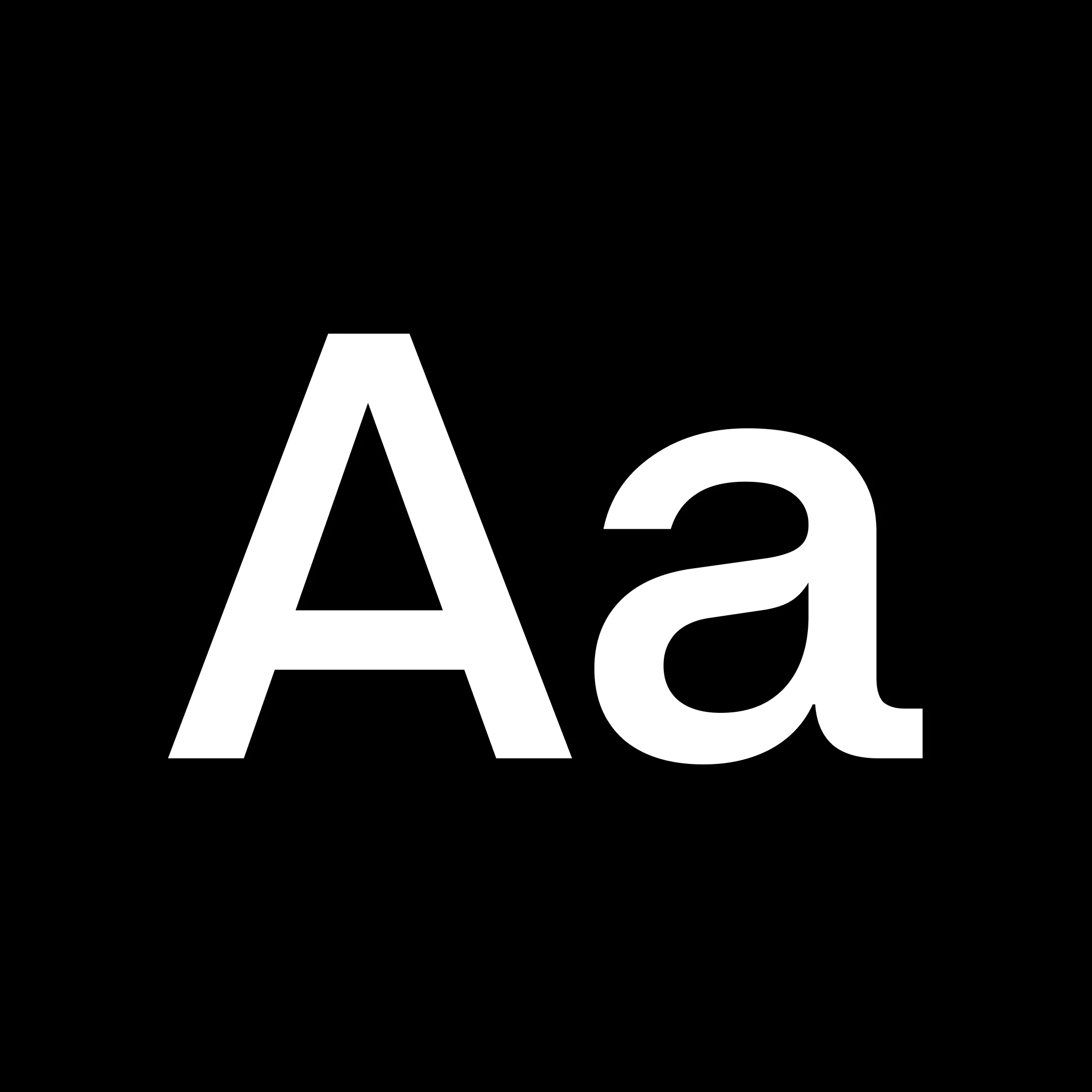
Neue Montreal
Neue Montreal is a versatile, timeless grotesque, rooted in the city's design legacy—from Expo 67 to its contemporary scene. It blends the quiet confidence of a reliable workhorse with the distinct character of a display face.
Continuously developed since its initial release, the typeface has seen its range steadily expand. It now features a full weight axis, from Hairline to Black, and supports Latin, Cyrillic, Greek, and Arabic scripts, covering 506 languages and 3.4 billion speakers.
For clear legibility at small sizes, a dedicated Text Size version is now also available.
Neue Montreal is already in use across identity, editorial, and digital work worldwide.
What’s new in Version 3.00
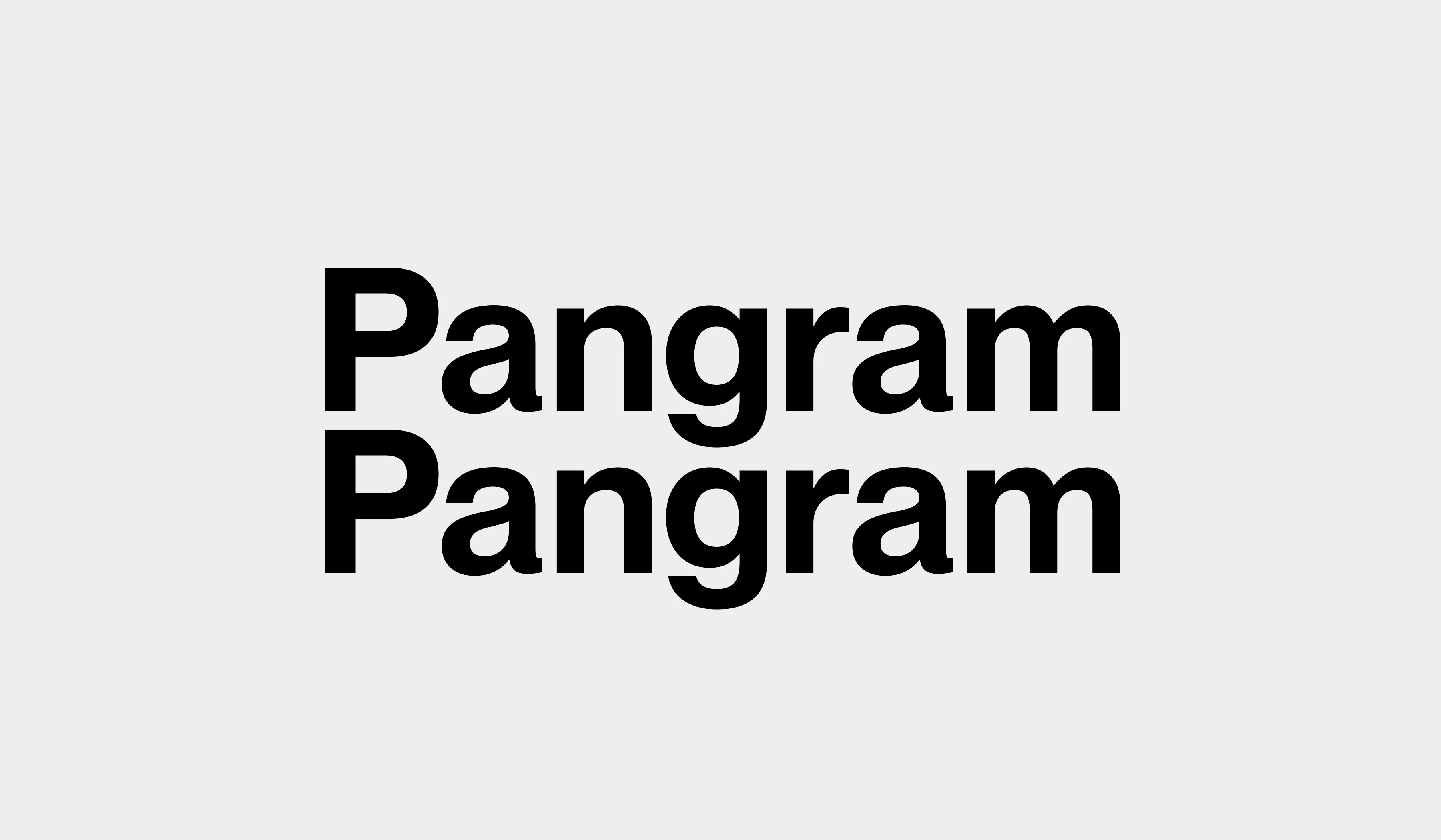
Expanded Weight Range & Refined Functionality
PP Neue Montreal 3 has received a significant update. We've grown the family from the previous Thin to Bold selection into a full, comprehensive weight range, from the delicate Hairline all the way to the heavy Black weight. All new weights include corresponding italic styles. In parallel with this expansion, we took the opportunity to review the entire design. We applied careful micro-adjustments across the character set to fine-tune the forms and improve the overall functionality and performance of the font across various environments and sizes.
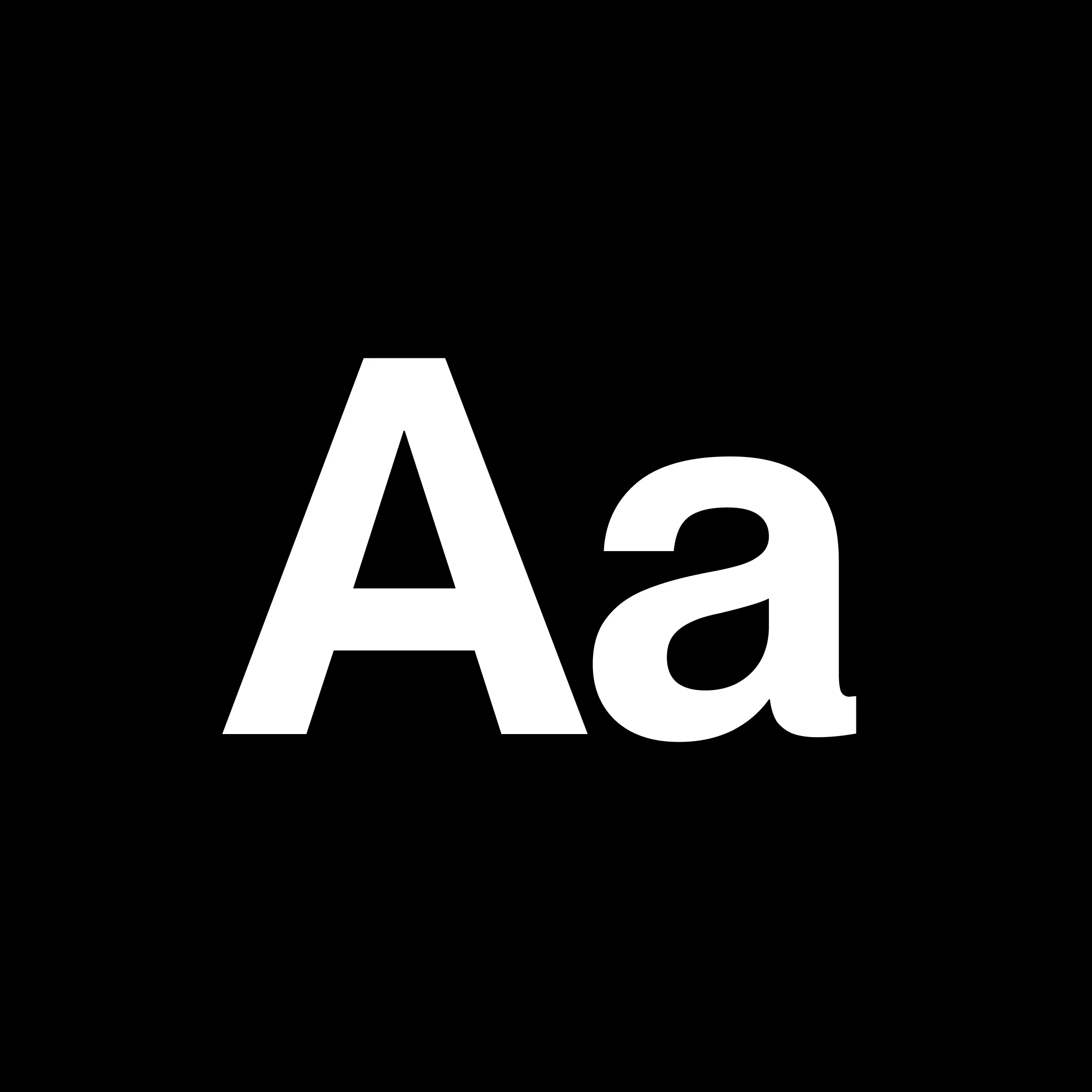
Introducing PP Neue Montreal Text
Following the character set expansion, we created a dedicated Text size version of the typeface, specifically engineered for optimal long-form reading and smaller sizes. This new version ranges from Light to Bold and features functional adjustments to boost legibility.
- Larger Apertures: Characters such as C, G, S, c, s, and a have larger openings, directly increasing the legibility of the typeface.
- Weight Corrections: Complex shapes received fine-tuned weight corrections to ensure clarity even at very small sizes.
- Spacing Adjustment: We applied a more generous spacing adjustment to further increase overall legibility in text blocks.
Original: $30.00
-65%$30.00
$10.50Neue Montreal
Neue Montreal is a versatile, timeless grotesque, rooted in the city's design legacy—from Expo 67 to its contemporary scene. It blends the quiet confidence of a reliable workhorse with the distinct character of a display face.
Continuously developed since its initial release, the typeface has seen its range steadily expand. It now features a full weight axis, from Hairline to Black, and supports Latin, Cyrillic, Greek, and Arabic scripts, covering 506 languages and 3.4 billion speakers.
For clear legibility at small sizes, a dedicated Text Size version is now also available.
Neue Montreal is already in use across identity, editorial, and digital work worldwide.
What’s new in Version 3.00
Expanded Weight Range & Refined Functionality
PP Neue Montreal 3 has received a significant update. We've grown the family from the previous Thin to Bold selection into a full, comprehensive weight range, from the delicate Hairline all the way to the heavy Black weight. All new weights include corresponding italic styles. In parallel with this expansion, we took the opportunity to review the entire design. We applied careful micro-adjustments across the character set to fine-tune the forms and improve the overall functionality and performance of the font across various environments and sizes.
Introducing PP Neue Montreal Text
Following the character set expansion, we created a dedicated Text size version of the typeface, specifically engineered for optimal long-form reading and smaller sizes. This new version ranges from Light to Bold and features functional adjustments to boost legibility.
- Larger Apertures: Characters such as C, G, S, c, s, and a have larger openings, directly increasing the legibility of the typeface.
- Weight Corrections: Complex shapes received fine-tuned weight corrections to ensure clarity even at very small sizes.
- Spacing Adjustment: We applied a more generous spacing adjustment to further increase overall legibility in text blocks.
Product Information
Product Information
Shipping & Returns
Shipping & Returns
Description
Neue Montreal is a versatile, timeless grotesque, rooted in the city's design legacy—from Expo 67 to its contemporary scene. It blends the quiet confidence of a reliable workhorse with the distinct character of a display face.
Continuously developed since its initial release, the typeface has seen its range steadily expand. It now features a full weight axis, from Hairline to Black, and supports Latin, Cyrillic, Greek, and Arabic scripts, covering 506 languages and 3.4 billion speakers.
For clear legibility at small sizes, a dedicated Text Size version is now also available.
Neue Montreal is already in use across identity, editorial, and digital work worldwide.
What’s new in Version 3.00
Expanded Weight Range & Refined Functionality
PP Neue Montreal 3 has received a significant update. We've grown the family from the previous Thin to Bold selection into a full, comprehensive weight range, from the delicate Hairline all the way to the heavy Black weight. All new weights include corresponding italic styles. In parallel with this expansion, we took the opportunity to review the entire design. We applied careful micro-adjustments across the character set to fine-tune the forms and improve the overall functionality and performance of the font across various environments and sizes.
Introducing PP Neue Montreal Text
Following the character set expansion, we created a dedicated Text size version of the typeface, specifically engineered for optimal long-form reading and smaller sizes. This new version ranges from Light to Bold and features functional adjustments to boost legibility.
- Larger Apertures: Characters such as C, G, S, c, s, and a have larger openings, directly increasing the legibility of the typeface.
- Weight Corrections: Complex shapes received fine-tuned weight corrections to ensure clarity even at very small sizes.
- Spacing Adjustment: We applied a more generous spacing adjustment to further increase overall legibility in text blocks.